Village Voice Media: Internet Piracy


August was great month because that was when Boo Davis at Seattle Weekly contacted me for a huge Village Voice Media project. Working with LAWeekly's Darrick Rainey, she was putting together a universal feature to be used in several of Village Voice's papers.

The subject was about a band of lawyers basically blackmailing those who illegally download movies; the sample cited often is Person-X downloads a movie he/she may not be proud of watching (something adult-oriented), and these lawyers track them down and mail them a letter saying "Pay us X-dollars or we will take you to court and make you Asian schoolgirl fetish public knowledge." Although frowned upon by many courts, it it really a sad situation as people typically just pay the money to stay out of court where the case would most likely be dropped as was the case in many examples in the article.

In the sketch phase, I tried to hit all the various angles of the story to give the art directors lots of options.


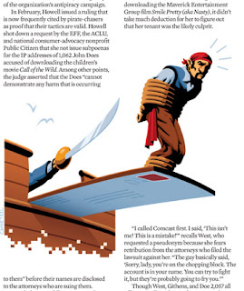
In the end, they decided to work the piracy angle, and I was quite excited to take their selections to final. One suggestion was to add the "digital element' to the images by having the images feature pixellation. So I made the skull look like it falling apart (to some, being shot) and the waves of the ship image feature cresting/droplets of pixels. The spots use pixels as waves crashing against the ship and as the gun's spark:


Spot images in context. Thanks to the awesome Andrew Nilsen for supplying these! He used them almost exactly as I had initially pictured them in layouts while sketching.


As you may notice, the gun changed quite a bit from sketch to final; this happened while I was working and I realized "Hey doofus, this should be a flintlock in order to complete the theme in all the images. So basically, I worked up and submitted two finals of the gun: one modern 9mm (not shown) and one flintlock pistol. Yes, I did more work than I needed to on a pretty tight deadline, but don't you think it looks much better as a set?

So that's a great project that was a blast to work on, and it resulted in images I am really happy to have in the portfolio. Thanks again to Boo and Darrick for the assignment, and thanks to the following papers for running the article and art: Seattle Weekly, LA Weekly, SF Weekly, Riverfront Times, Miami New Times, and New Times Broward.

To read the article, visit any of the above papers websites. Thanks for reading!

Enjoy the Day,
Chris

Sports Illustrated: Soccer Dream Team

I recently completed a monster project for Sports Illustrated for a "Best Lineup" article; the folks at SI put together their soccer dream team, and they needed an image involving all of them (including the coach!) After some discussion over the phone we settled on the idea of the "team" running onto the field, and I added some dust and ambiance for mood :)

Sketch (took about 20 hours including shooting ref):
The final art took around 55-60 hours as I'm pretty slow when it comes to digitally nailing a likeness; I find it hard to translate the sketch into shapes when it has to look like a specific person (generic faces out of my head are so much easier to light). So I sit there for hours per head: 
Tweak this. Tweak that.
Raise this. Lower that.
Stretch this. Squash that. 
(Repeat 1,256,489,364,497.7325 times.)
A helpful hint in likenesses is to nail down the triangle formed by their pupils and tip of the nose; I read this somewhere and it really does help; I suppose its because that is the area we look at the most on a person's face, and it is subconsciously filed away in our minds (face-recognition technology: in your brain).

The bodies go much quicker, although with this particular group, everyone needed VERY specific uniform patches, logos, etc. In the initial final art, everyone was wearing a generic Puma shoe based off of my own pair. Well, that is a big no-no, ladies and gentlemen. I had to revise all the shoes so that SI wouldn't have the players' sponsors calling them up with complaints! ( It had happened to the Craig, the AD, before!)

Spread-layout (close-ups of players are below):


As a bonus (literally), they decided to run the art on the cover!


And finally, here is a diagram I also did for the same issue. Not shown here, each player was featured on a page with bio/photo, etc; included on each page was this little diagram (about 2x2) with that player in color and the rest silhouetted. Here you get to see them all in one tiny image.

A very generic sketch (since it was to be so small, we weren't worrying about details at this point):


Thanks to Craig for hanging in there on this beast of an assignment! While it was a ton of work, it was a great project to take part in, and I look forward to future collaborations with a magazine I worshipped as a kid. In elementary school, a friend and I would spend time after school in the library where we would re-shelf books! Afterward, the librarian would let us pick through old magazines for a job well done, and I always tried to snag SI or SI for kids! 

Enjoy the Day,
Chris

Steve Jobs: 1955-2011

I recently had a Steve Jobs portrait commission. As part of a multiple-portrait assignment, I only had time for two sketches per person. The AD selected the first sketch, and the job was killed after I finished the final art, but then revived after his death.  Sketches:


As lame as it sounds, I am very grateful for what Mr. Jobs brought to the world through his vision. I've heard that Apple has had some labor issues, and I can't speak on that without more research. I only know that this man's vision has created products that beautiful and that I appreciate (although I always have to wait for price drops).

Thank you, sir.

And thank YOU for reading!

Enjoy the Day,
Chris

Major League Baseball: All-Star Game Program

Here is a synopsis of a piece I did for July's MLB All-Star Game. I was super-excited to do this assignment after creating the images for 2010's World Series program. This article was a "who's who" of pitchers and their stats, and the AD wanted to work in a manner that was metaphoric of all of the league's pitchers. After some discussion, we decided to use the pitching hand to represent all of the athletes.

Sketches:


The AD deiced to go with option #1 (also my favorite), and a request was made for "revolutionary-style" colors. I was put in charge of also working the text into the image for a cohesive look and feel.


I added some stars in there since they're all stars in my eyes. Get it? "All stars?!?" I crack myself up.

Thanks for reading!

Enjoy the Day,
Chris

Sketchbook Excerpts Vol. 8

Sadly, the sketchbook has been neglected these past couple of months with work and social obligations (the holidays, ya know?). I'm hoping that getting back into the routine of blog posting will get me back into the swing:


Enjoy the Day,
Chris