Healthy Food Fight Poster

Over the summer I was very pleased to work with a NY design firm on a really fun project. They had been picked to provide art and design for a nationwide cooking event; I was lucky enough to be chosen as the artist for the project!!! Even though this was a quick turnaround, everyone was really easy to work with, and I'm so happy to finally feature this artwork.

A special thanks to Cozette and Tybre for helping me out by being photo-shoot models!

Initial sketches (three poster-type images and logo treatments):
Revised sketches (the client requested the cooks look like backyard chefs as opposed to professionals. This was so obvious after they pointed it out, I literally slapped my forehead):


Final artwork (the color palette was used to fit the client's branding. I think it really made the artwork much better and I'm now trying more color substitutions for shadows):

Enjoy the Day,
Chris

Philadelphia Magazine: The Bruppies

I was very lucky to get a call from Philadelphia for a 1/2 page illustration at the end of April. The article was about white-collar workers seeking out blue-collar jobs as the economy changes. This new workforce, called "bruppies" (blue-collar yuppies) is growing as more people either seek out labor jobs after being laid off or after just getting bored with cubicle life. In the article, several examples of people starting their own business as well as places to get training for such careers are discussed in great detail.

My initial sketches:
I favored sketch #1 as I felt it really "hit the nail on the head" (sorry for the pun.) Sketch one showed a business suit built from boards and nails. Sketch #2 is a man so dirty from working in white collar clothes that the dirt leaves an outline where his tie was. Sketch#3 is the weakest and shows a white-collar worker playing dress-up as a carpenter. And sketch#4 is the iconic figure taking control of his future by brandishing some huge tools.


Revised sketch: The AD decided to go with the final option as it was the idea he wanted to see sketch in our initial conversation. There was a request from upstairs that the figure be given a suit jacket to cover his vest. I really liked the vest version, but I was happy to oblige.

While working on the artwork, Jesse (the AD) called me and let me know that they now want to run the story as a feature with a spread and spot! How awesome! We had to alter the artwork to fit a 2-page spread so I lengthened the figure and he would now span onto the left page where text would be laid out.

For the spot artwork, the AD wanted something highlighting the education aspect of the article as it would accompany a blurb listing places to go for classes.

Accompanying spot sketches:
Final art:
Thanks to Jesse for making a regular job into a fantastic job!

Enjoy the Day,
Chris

SMASH Magazine: Footwork!

Featured in this post is some sport-based artwork for SMASH, a teen magazine published by Tennis. In a great turn of events, an AD I worked with at Cincinnati relocated to NYC and took a position at Tennis. Congrats to Dennis for making his big move to the Big Apple!

The article is an instructional section of the magazine that helps kids and teens improve their tennis game. This particular article addresses a player's footwork. To me, the main emphasis was on constant foot movement and small steps at a high volume to maintain control and get to the ball. Here are the submitted sketches:

Dennis liked the extreme perspective version, and I was more than happy to take it to finish! With this piece, I tried to open up my color palette a bit as I have been getting numerous requests for the red/gold or red/white limited color work. I am pretty happy with this piece, and I think it is exciting for both grown-ups and kids to view. The final art in context:
Enjoy the Day,
Chris

Sketchbook Excerpts Vol. 5

Here are some recent sketchbook pages done on a cheap craft paper. Its a small sketchbook I work in when I feel like my regular sketchbook work is getting stale or if I feel like I need to do some academic-type studies to keep my rear in gear.
As with the regular sketchbook, no eraser to make myself commit to a line. Just playing with working on a mid-tone surface, different pens and pencils, line vs shape, etc:

Enjoy the Day,
Chris

Forward Magazine: Bankrupt Nation

Here is some new artwork from a great client, Forward Magazine.

From the art director's lips (or rather, the email): "This story is simply about the great debt our nation is in. I think we want to depict the “gruesome” aspect of this topic, and really drive home the point that our debt is ruinous. Your style struck a chord with me because you’ve done several pieces that are sort of dramatic in manner, but can deliver the message in a palpable way. I’ve attached a cover template so you can also get an idea of where things fall in placement. I’d like to get 3-5 different sketches, and then we’ll choose one for cover, one for inside."

Sketches:

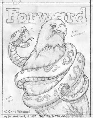
Heh, I really liked this sketch! I think it was the lighting; seems like it would have been fun to take to final. However, I think it was a bit too much for the art director; also, my girlfriend said it was a little over the top. Well, you should have seen it before I photoshopped out the blood. I have yet to illustrate a piece with a snake! This has to happen at some point.

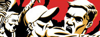
And the same could be said for this sketch. I was really happy with my body language on this one as well as the hanky in his pocket. Was a bit too violent? But it's metaphorical violence! No? Ok...

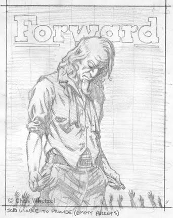
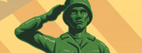
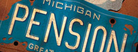
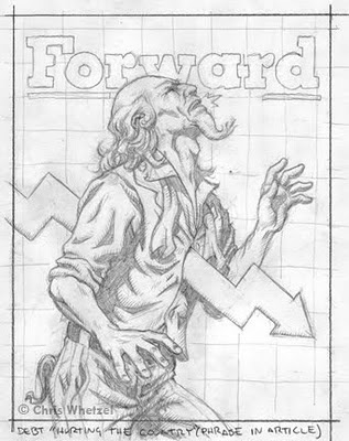
A penniless Sam, pretty straightforward.

Lady Liberty drowning in red ink (quote from article) explored in two sketches.

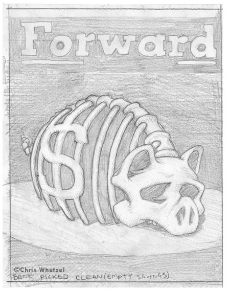
And lastly, a bank picked clean.

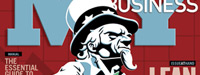
The art director chose the Uncle Sam sketch, and I can understand why. This sketch is subtle and still dramatic, an approach I think is often best. As such, I try to offer a sketch of this type in every assignment.

Initially, the sketch was just Sam, and I added the reaching hands at the end as I felt it just needed something to represent the middle class victims (you and me) of the economic storm. I also like the play of scale between such small figures and a giant Uncle Sam that cannot help them.

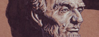
Final Cover Artwork:

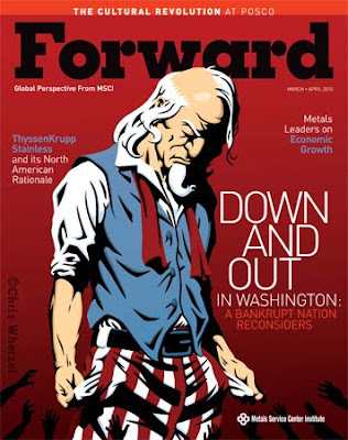
I slightly adjusted the cover art :) The masthead was overlapping Uncle Sam's head, and I reversed it for sake of the portfolio. Thanks for reading!

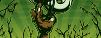
 The art director then went with the torch as the interior image:

Thanks to Gretchen for a terrific assignment!
Enjoy the Day,
Chris

Las Vegas Weekly: Criminals In the Family

Ryan at Las Vegas Weekly recently contacted me with an assignment I found pretty intriguing: one person's conflict about turning a family member over to the police. It seemed to be a situation no one would ever want to be in, and I thought it could make foe a good image. The deadline for this cover was very tight so I worked up some roughs for the AD to choose from:
VERY rough, I know. But when I provide such rough ideas, I work out a refined sketch to give the AD a good idea of what the final will look like; this also allows them to get a jumpstart on the layout:
I really like the way this cover turned out. I went through a lot of color versions only to come back to this approach.
Thanks to Ryan for encouraging me to work on a black background; that's always fun!

Enjoy the Day!
Chris

America's 1st Freedom: Richard Daley

I was very fortunate to be contacted by America's 1st Freedom back in March; they wanted a portrait of Chicago Mayor Richard Daley for their "First Things First" spread. America's 1st Freedom is a National Rifle Association magazine. Having grown up in a hunting and fishing family, I feel strongly about the right to bear arms. However, I also see the problems with guns in the wrong hands; it's a tough situation to mediate. But according to the article, Mayor Daley is advocating his drastic approach even though it is highly likely to be deemed unconstitutional, and he will continue his support of harsh firearm laws after this ruling. It seems even the Supreme Court can't get through to him.

Playing off the themes of immaturity and ignorance, I worked up these sketches:
As you can see, I had no qualms about showing Daley in a negative light; the AD felt the same way about the mayor's demeanor. Thanks to the AD for the photo reference as well! Here's a quick rundown (clockwise): temper tantrum, pouting schoolboy, blank face with plugged ears (grumpy alternative). I also thumbnailed possible layouts for the AD to work off of based on the sketches as well as some alternative compositions for the portrait.

These sketches were a bit rough due to a busy schedule, but the AD was cool about it. Thanks, Clay!

Pouting Daley was chosen for the final art, and I was thrilled. One reason noted was "I love the idea of putting him in a beanie in our mag." Ha ha!

Finals:

Sadly, the beanie had to go as the NRA gave it the axe. Ah well, what can you do? Also, there is a very subtle color difference after I lost the beanie because I warmed up the colors a bit. Looking at the sketch, I think I like the initial likeness more; he's too pretty in vector :)

Thanks for reading, and thanks to Clay for supporting the beanie until the very end!

Enjoy the Day,
Chris

Sketchbook Excerpts Vol. 4

Hello. Here are some more sketch pages. I'm aiming at sharing these in every volume of the newletter. Feedback is always welcome!

Enjoy the Day,
Chris

The CRISIS Magazine: Hollywood Issue

I was very lucky to get a repeat commission from The CRISIS magazine in January. Wayne was looking for a bold image for the cover of their Hollywood issue. The main push of the issue is how there are not many African Americans in the film industry, and he wanted to work with a portrait of a film-industry African American calling others to action. The sketches:The first sketch was a spoof of the popular Rodchenko poster that was imitated for many album covers including Franz Ferdinand. Next was a Moses-type figure with film reels. Basically, with this image I was communicating that film is a way for African Americans to deliver a message by having a figure "delivering" the film to us, the viewer. Sketch 3 is pretty straightforward, and it depicts an African American man with dreadlocks that morph into rolls of film. The last sketch is of a figure calling for action through a microphone; this sketch operates on two levels by not only calling to action but also alluding to a film director using a megaphone on set.
Wayne decided to go with the last sketch, and he requested that I incorporate the word "Action!" into the image. I tried doing so in several ways including overlaying it and using a speech balloon to isolate what I thought would be the main article. However, it turned out that it was not an article headline, but simply text to accompany the image so he chose the overlay. Final art:
Among several color mocks, we originally decided to go with a red background and lots of bleed as he had a large amount of text to work with, but then we decided to use the figure against white. Above is the submitted final art and the final cover after the revision. I'm happy to say that we managed to stay very close to my original composition; I felt bleeding the megaphone off the right side was an invitation to the reader to open the cover. Thanks to Wayne for a great assignment!

-Enjoy the Day,
Chris

Connecticut Magazine: Rating the Small Towns

Here is a quick rundown of a recent commission from Connecticut Magazine. The article was their annual "Rating the small towns," in which the towns of Connecticut are judged on crime, culture, education, etc. Cover sketches:

The article also had a spot illustration. Note how these spots tie-in with the cover themes, and yet the art director also has a choice of mixing up themes if need be. Sketches:

The art director decided that she like the first cover sketch and the gauge-theme spot illo, but she wanted to place the cover sketch's #1 on something rather than it be a giant object itself. She asked for a hot-air balloon, and I did a quick revision. The art director tried it out with the text, and she liked it. After approval, I provided the refined drawing on the right to give her a better idea of the final art:

Final artwork:

I mocked up this cover based on the text the art director tested on the sketch; I think its pretty close to the actual cover. I'll find out when the issue arrives!

Enjoy the Day,
Chris

California Lawyer: Challenging Porposition #8

Jake at California Lawyer contacted me at the end of 2009 with a pretty moody cover subject: the plotting behind California's Proposition #8. The gist of the story is that "for months the people backing the case had been operating in stealth mode because they wanted the federal complaint to be the lawsuit challenging the constitutionality of Proposition 8, the successful 2008 initiative that had declared, 'Only marriage between a man and a woman is valid and recognized in California.' "

The art direction of the article was to focus on the secretive planning aspect as if this is a movie scene when the bank heist plan is being planned. The sketches:


I looked at a lot of old movie stills to get that moody, deceptive atmosphere. The second sketch was originally not seen through a door, and that was added after Jake's great suggestion. It really helped the image. The finished artwork with text I mocked over the image:

I never received a tearsheet or saw the cover, so I faked this text to place the illustration in context; this is one of those images that looks weird without type due to the large black shape on the right. I made a few adjustments to facilitate the text such as removing the window frame, making the background into the shadow of the lamp on the yellow wall.

Enjoy the Day,
Chris